Tuesday 14 December 2010

Final Site


This is my home page. I decided to use flash for this as i already have an about page.


My about page is very simple as it was only for information.


My projects page needs tweeking a bit as the image i had created didnt fit the page well . I will have to change this in photoshop then add it to my site.


My contact page works very well. My email link works and connects to an actual emailing form.

My final link to the site it on part of my blog under the title FINAL SITE-Modern Architecture.

Copy Right

This page is to show the images that i had taken from the internet and used for part of my design work.

The majority of the images used i had found in google as it was my main source of images. I used images from the web as it was easier to find modern architecture on there rather than going out and finding buildings myself in a short period of time.

I used this image in my flash design as it showed modern aspects in it, and fitted well. 


https://blogger.googleusercontent.com/img/b/R29vZ2xl/AVvXsEgAtSSLNqU2qGnpdoJsXAsSk2wH7keBgtxguV3B_xItws0wh9uw7bh8-Muu4Q90i35YYE5oT0_pOZI7hl5KLHjxFNexBaRMDS6ndpfB4HreI0RNbVGLgvmth-7C9TI-ImhUbdfThsEiOFQX/s1600/Walk+In+New+York+2009+-+Empire+State+Building+view+of+Top+Of+The+Rock+5.jpg


I used this in some of my flash ideas. I also took this image off google i used this when i was learning how to mask layers and images.

http://www.google.co.uk/images?client=safari&rls=en&q=modern+architecture&oe=UTF-8&redir_esc=&um=1&ie=UTF-8&source=og&sa=N&hl=en&tab=wi&biw=1024&bih=726

I also used images from google on my header and footer designs.


This was the first image it had used.


http://www.google.co.uk/imgres?imgurl=https://blogger.googleusercontent.com/img/b/R29vZ2xl/AVvXsEgYjri57cEv6XK-r20Qsk3tp7PcB_NjR_6BBPKD5OPGZfTxwxOb3T8R5PekEQjKpKXKvRFRyNZj2putTIMjjJh2WTHFjgqNMI67DVOzYccqkm74ftgBal0qVBdes-M6H8YHIeJIwN4fexOh/s760/DetroitSkyline.jpg&imgrefurl=http://appraisalprosprose.blogspot.com/&usg=__15XwDCIvHoh0nkuIGlJ-nj9Zg3c=&h=427&w=641&sz=30&hl=en&start=0&zoom=1&tbnid=XhIJsZp9GdTVCM:&tbnh=143&tbnw=191&prev=/images%3Fq%3Dcity%2Bskyline%26um%3D1%26hl%3Den%26client%3Dsafari%26sa%3DN%26rls%3Den%26biw%3D1024%26bih%3D726%26tbs%3Disch:1&um=1&itbs=1&iact=rc&dur=158&ei=NEUHTYKzL8uEhQeZ_MHeCw&oei=NEUHTYKzL8uEhQeZ_MHeCw&esq=1&page=1&ndsp=12&ved=1t:429,r:5,s:0&tx=83&ty=63


As you can see i then edited the image in photoshop and added it to my container on dreamweaver. 

Sunday 5 December 2010

Navigation Ideas

I decided to create my own navigation bar ideas. To see what it would look like with my site.

I thought that it may be easier to use symbols than text. I had to find the right symbol for each of my pages. I had created one for My home,about, services and contact page. It was quite difficult to come up with a symbol that would represent the about page. These buttons will be placed in a specific way on my page rather than in the most traditional way of being either in a line at the top underneath the header or at the side.
These buttons will have to be made in photoshop and then imported onto Flash and transformed into a button that way.


I then created some very simple navigation buttons that just included text aswell having a navigation bar with just symbols. The colours arent very good but they kind of go with my colour scheme. I will create these in Flash by using the tools in the program.


I then experimented with other symbols and colours. The colours in this match the logo i have created. I would possilby use this for my site. I will have to edit this in photoshop also and then turn the images into buttons on Flash.


I have also experimented with images and the way i place my text. I wanted some form or building like imagery involved in my navigation bar to make it a little bit more exciting and quirky. I had decided to do something like this whilst working in my sketchbook. When i was coming up with different web page ideas.
I like the way the text stands out from the background as if its actually on the step.
I then experiemted with colour and the different effects i could use on my navigation image.

In order to create a good navigation bar i had to make sure that the text was readable and easy to use i thought that this idea worked quite well as it clearly shows the text.


Splash Page Research And Idea

To get a better understanding of how a splash page works and what it looks like i have done some research on what they look like and how they work.


This was the frirst splash that i had looked at.

This page is very bright and simple. It advertises the brand or company ina  way with its logo above the enter button whcih takes you to the main page I found this page very easy to look at and to navigate.


I then went on to look at more complex web designs that i could look at in great depth.


I really enjoyed looking at this as it was very interactive and the majority of the site had been created in flash or another programm that is similar. The best part of the actual site is the splash page it is very simple and interesting it terms of its layout and the images that are used. It also gives you an option in what language you want to view the site in and this acts as the enter button into the actual site.


This is another site that i was very interested in. the way it has been made looks very complicated, but once i had looked it in more depth i realised that it only has the two buttons that you click to go through to the next splash page. This page also gives you more that one option in what way you can enter.

I then went on to look at the next splash page that was linked to this site. This page was a lot more interactive. You had to click onto the eye to actually get to the other pages in the site. This was quite misleading as there was lots of moving parts on the site. Re creating you this would be very complicated for me.


.......

Ideas


This Is my first idea for a splash page. It is very simple and something i would be able to make on Flash. I would simple mask an image with the text i want and create a classic tween to enable the image behind the text to move. I will then add a button and image.
I think that this would work for my final splash page. I will make this for my site during the final stages of production.


Banner Ideas.

As well as creating designs on Flash I have designed some on Photoshop so i can look at my different ideas and possibly incorporate them into one design for my site.

This was my first idea using just text. I dont think that this idea is very good. Its very plain and boring i want something with more colour so that it stands out a bit more and something that also links in with my sites theme.


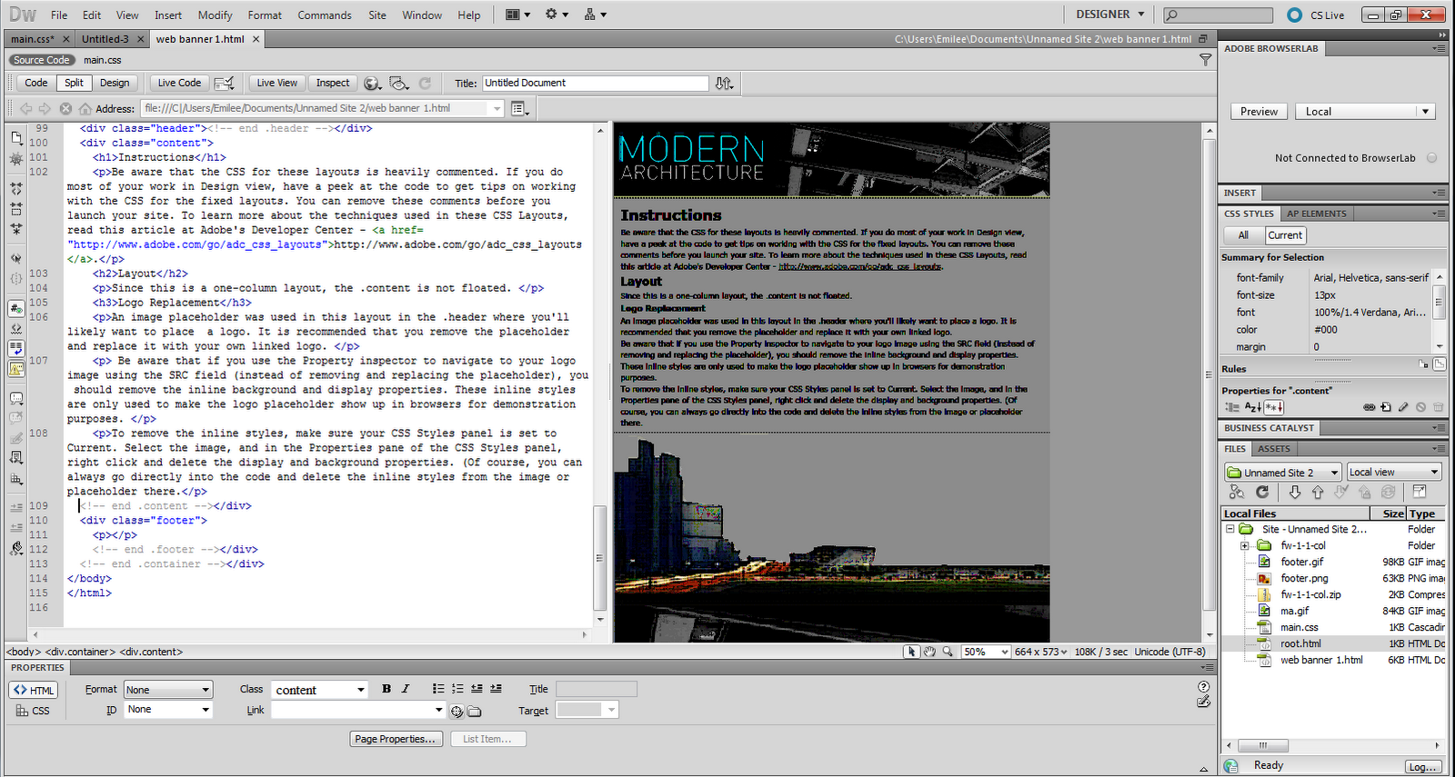
The text kind of fits in together. I would consider changing the 'architecture' text as it looks too gothic for the page.

I decided to play around with text more than anything as it was something i found interesting during the research period.
I decided to do something simple with this banner. This is becasue i will actually animate this in Flash Where the text will come together.


This will be the start of my banner


My banner will then start to move and the text will come together


.....

I then went on the experiment with colour and images.


This was  my first design i created. I wanted to stick to a colour scheme that fitted with my header text. I decided to use this as the basis of my design and incorporated the colours into this design.
I did this by using the gradient tool in facebook and edited it with a filter. I then added silhouettes of buildings on top of the background. Once i had finished this design i realised that it was too modern and was more likely to attract a younger audience than what i aiming at.


This idea has both modern aspects and professional aspects. It shows the type of work that the company is involved in and also gives it an idea that its new and repsresent the company name ' Modern Architecture'. The only thing that botheres me is the fact that the majority of ideas are very dark so that they stick with my black, white and grey theme i will have to consider changing some aspects of my site, in order to make it more interesting and to grab the attention of my target market.


I then Went on to create something that was a little bit more brighter but stuck with the colours i wanted. I created this by using a background image i had used before on a previous design i then inverted it and addfed silhouettes of scaffolding and other various things. I also added my company logo and added a drawing of some architectural plans and changed the opacity so that it didnt over power the rest of the banner. I think that this design looks a lot more like a construction companies banner.

 
I also decided to make a moving banner that could act as both my splash page and ad banner. This is just a rough idea of what it could look like. I will do this by using the mask layout tool in Flash and have a moving image in the background.


 ....


The top banner i designed looks like an ad for taratan and thats definately not what im selling. The bottom one lookes a lot more suitable. I took this from my main head design and inverted the image.

Saturday 4 December 2010

Flash Banner Research

I am researching online flash banners so i will be able to create my own advertisement banner for my site. I will look at how they are created and the aesthetics of the banner. I will then design my own banner that i will possilby make in Flash.


 I wanted to look at a banner that related to the theme of my site so that i would understand what a ad banner for architecture would look like. This banner looks too outdated for me to take ideas from because i have chosen to look at more modern architecture. I think that its style works well considering the theme it has ' Architecture And History'. I think that the choice of colours that are used for this banner arent something that i would possibly use as they dont grab my attetntion that much. I am more drawn to the blues rather than the rest of the image.


This banner is very different to the previous one i looked at. I wanted to cover a large range of styles and companies and look at how they would advertise. THis one is quite attention grabbing because of its sort of 3D effect it has with the van coming out of the page. The green used also works with the logo on the side of the van whcih makes it all link to together. The text also looks as if its moving along with the van. THis could be a good idea. Rather than creating an actual moving banner i could create a banner that gives the illusion of movement.


This is a moving banner that i found on a website in google. The actual text moves in this image. I would like to experiment with text whilst creating my banner or splash page.
This design doesnt really go with what i would like in a banner so i will possibly take the idea of moving text and incorporate it into my own ideas.


This banner is very modern and simple with its use of text and its layout. You can tell how this banner is animated just by looking at this still image. You can see where the text will go in and out of the page. THis is apparent in the 09 part of the text and where the I's join in with the rest of the text. I am interested in using just text as a banner. I will try animating text on Flash.


Tuesday 30 November 2010

Task 2

For task 2 I have created different header and footer designs on the software Dreamweaver where i have changed and manipulated the CSS codes to do this.

C:\Users\Emilee\Documents\Unnamed Site 2\web banner 1.html

This is a screen grab of my working on dreamweaver, as I had some difficulty trying to link it online from my home server.


This design is based on my actual site that i have designed i chose to look different footers. I decided to keep the header the same as it plays a big part in my design.

This was the link to my second design

C:\Users\Emilee\Documents\Unnamed Site 2\web banner 12.html


I wanted to create something different that wasnt linked to my chosen theme so i decided to use a different image and edited it on photoshop and saved it for the web and devices.


This is what my web page looked like online.


THis is another Header that i created and used on Dreamweaver. I originally took this image from Google as i couldnt take a photo of a sky line my self.


This was the Footer of my site i did this by splitting the image into two so that it didnt look odd and blended well together.


THis is what my idea looked like whilst i was working on dreamweaver the Header and Footer both stand out from the black background.This is the sort of effect i want my site to have where my designs stand out and can be memorable.

Final Header & Footer Task


Monday 22 November 2010

presentation

<iframe src="http://show.zoho.com/embed?id=987487000000004015" height="335" width="450" name="Web" scrolling=no frameBorder="0" style="border:1px solid #AABBCC"></iframe>

Sunday 31 October 2010

Architecture Website Logo Designs & Research

Research

I have decided to look at the different architectural logo designs that are currently being used. This will give me a better idea on what features my own personal corporate identity will be like.


This sort of logo design reminds me of and estate agent or an eco friendly firm.
I think it reminds me of this because of the shapes and the two greens that are used. I want my design to have more than one colour element to it.


This logo is very modern and simple, I would like to follow the same style as this by using simple shapes.


I do not like this design very much as it seem rather out dated and wouldnt look very good on a new modern website. I think that it is too dark and doesnt make a statement about the firm.


Looking at all these logos i have found that the colour green is a very popular amongst most architecture companies. I will do something that is completely different to most of the brand identitiys that are being currently used.


Designs
To make my website look professional i have created a number of different logo designs. I will place one of these onto either the header or footer of my page.

This is the text i will be using for my logo i like how i have made it modern by using two different fonts and making them fit the actual text.


Navigation bars


A navigation bar (also known as a links bar or link bar) is a sub region of a web page that contains hypertext links in order to navigate between the pages of a website ( Wikipedia)

The main function of a website is to navigate to different pages. A navigation bar helps us do this. Navigation bars are the main source in which we find the pages/content we need. For example you could look at the MSN.com navigation bar, this contains lots of different ''links to the pagesyou are looking for.


This navigation bar gives you the different catergories that are available within the web site. This is much easier for the user and saves time.


Whilst researching navigation bars i found that the majority follow the two click principal of the web. The content is also very short as it is easier to read and therefore you can quickly choose what you want. For example if a navigation bar contained large words and sentences we wouldnt find this easy to use.

Styles

I have found that all navigation bars come in different styles depending on the design and what the content on the bars are.
Navigation bars are made by creating a html sheet whcih will determine what the content is on a website. You can then edit the style of a nav bar by creating a Cascading Style Sheet (CSS) which will allow you to change the padding, colour, hover colour and the font.

I found this design on the website
This site is very good and allows me to edit the Cascading Style Sheet where i can make the navigation bar my own design.